
Smells Gorgeous.
Smells Gorgeous.
- Strategy
- Branding
- Design
- Packaging
- Advertising
- Content
- Production
CHALLENGE
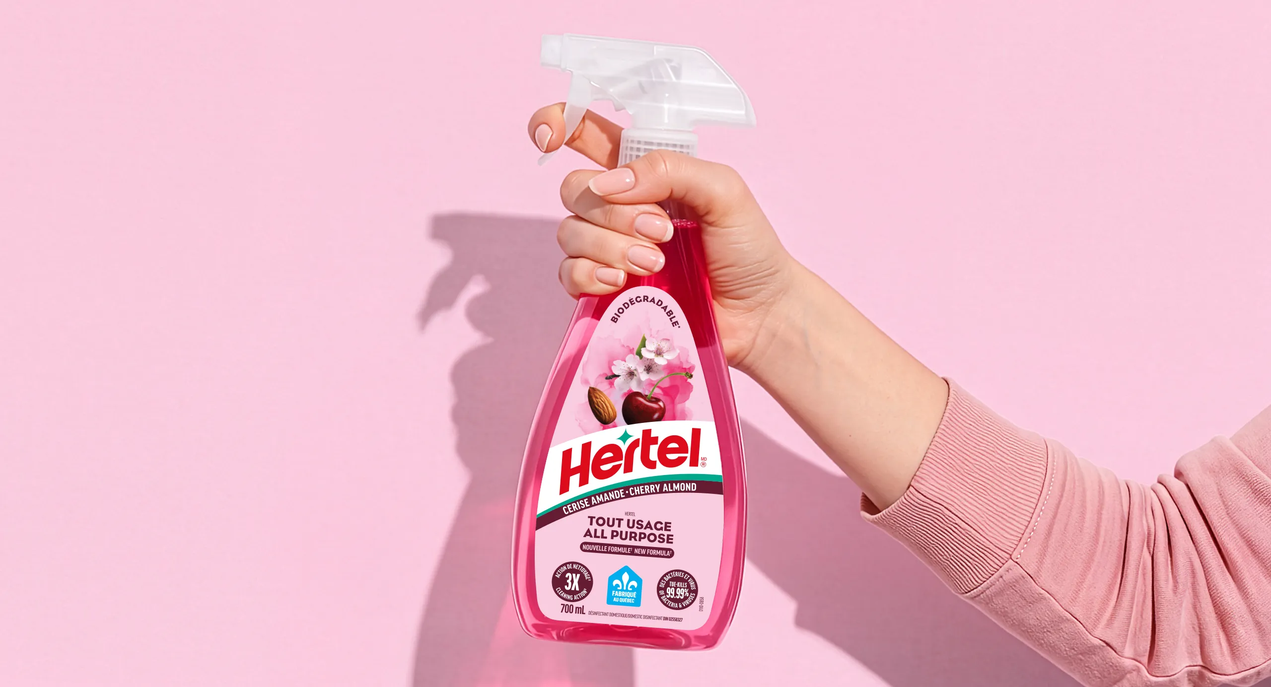
In a largely undifferentiated category where cleaning brands compete mainly on performance, Hertel needed to stand out and modernize its image. The challenge: refresh a well-established Quebec brand while giving it a more distinctive, contemporary and emotional territory.
OUR PERSPECTIVE
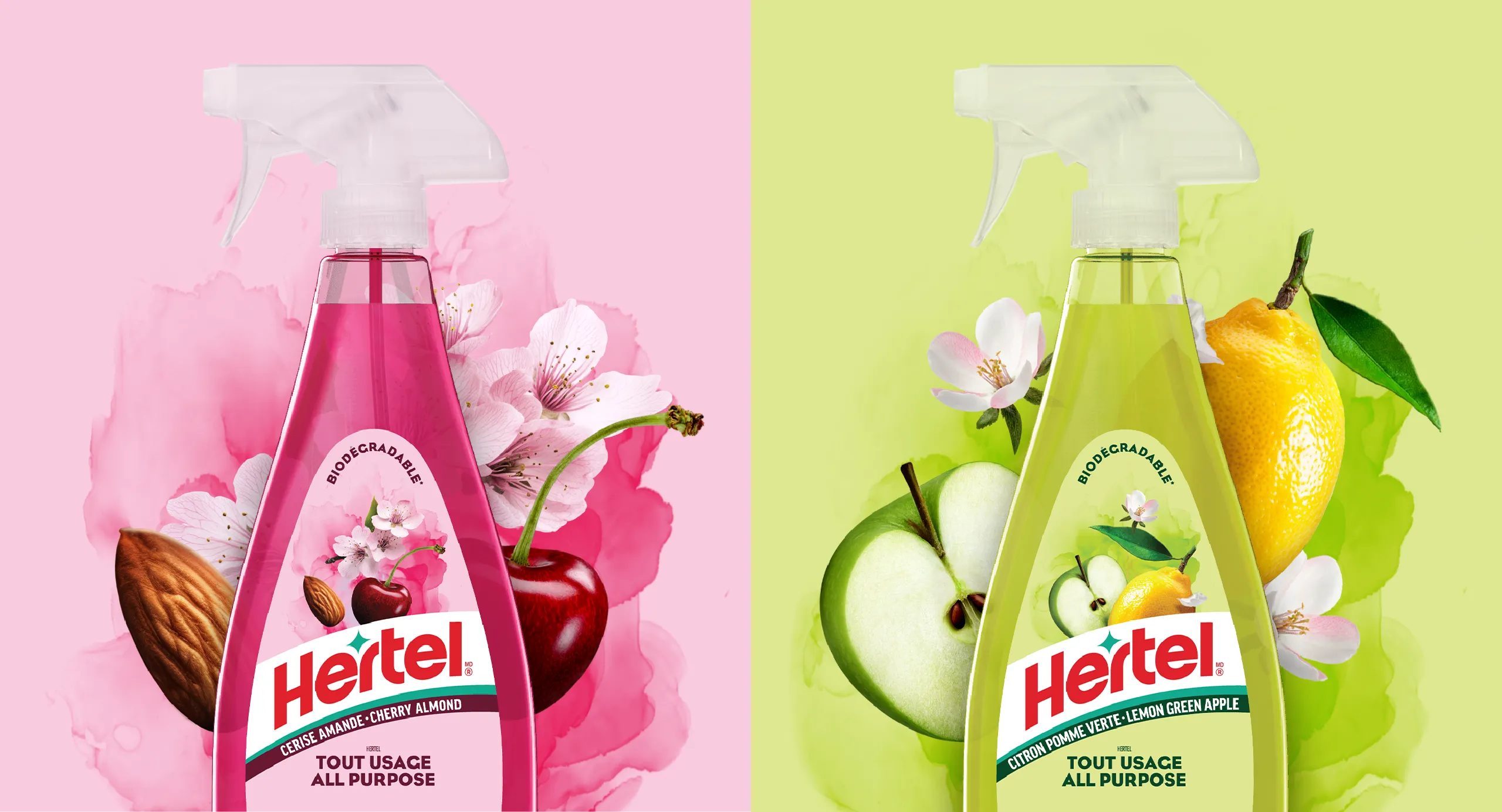
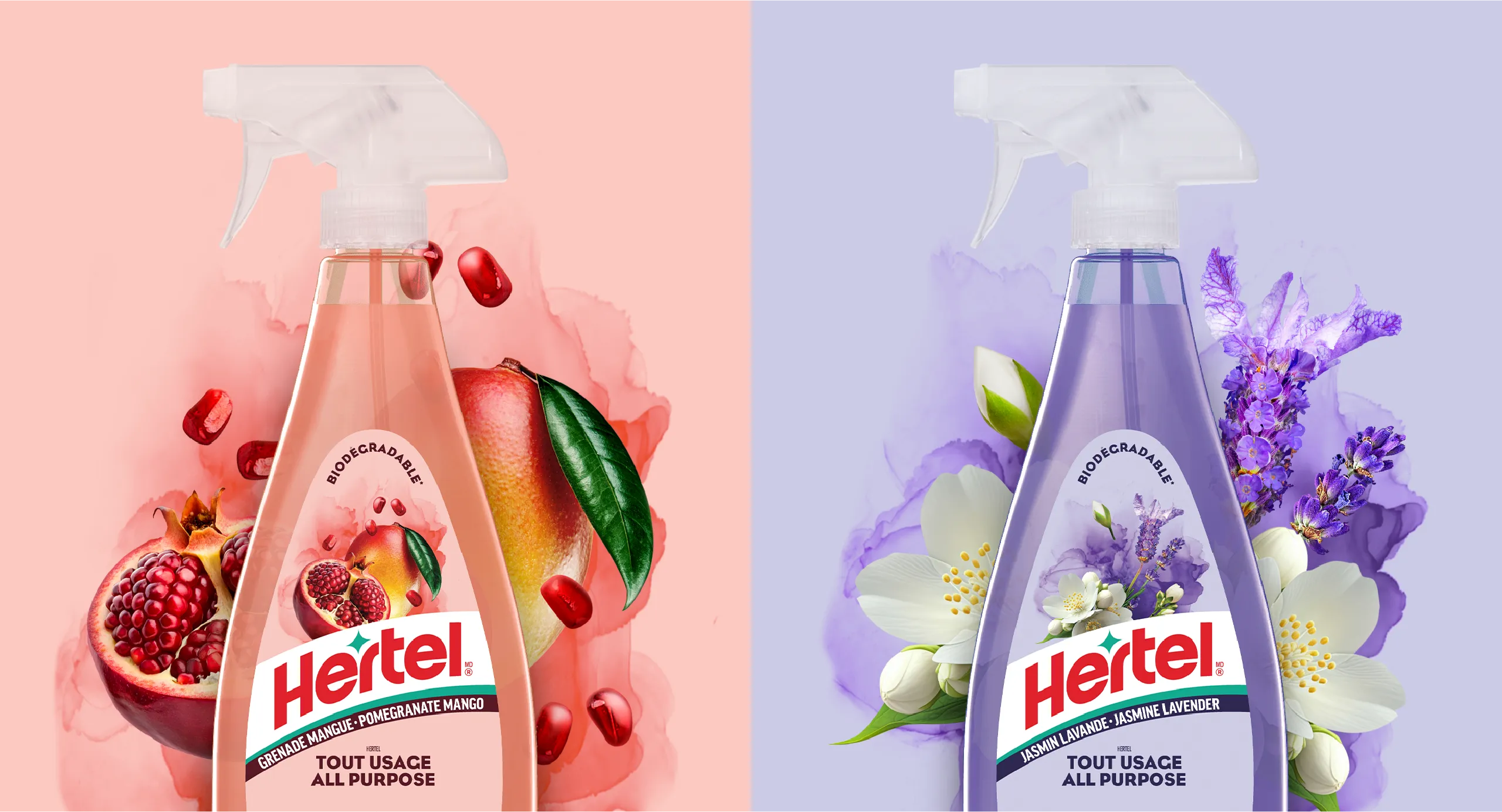
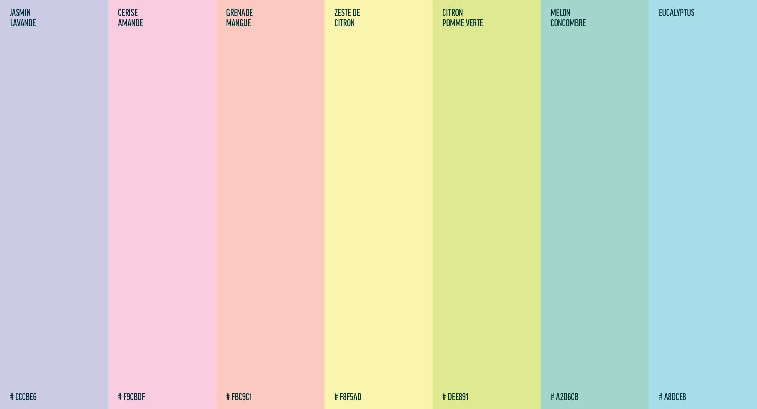
Rather than talking once again about cleanliness and performance, we chose to focus on what makes the Hertel experience more enjoyable: its fragrances. Inspired by their ingredients, colours and beauty, we transformed a functional benefit into a distinctive brand territory.
THE SOLUTION
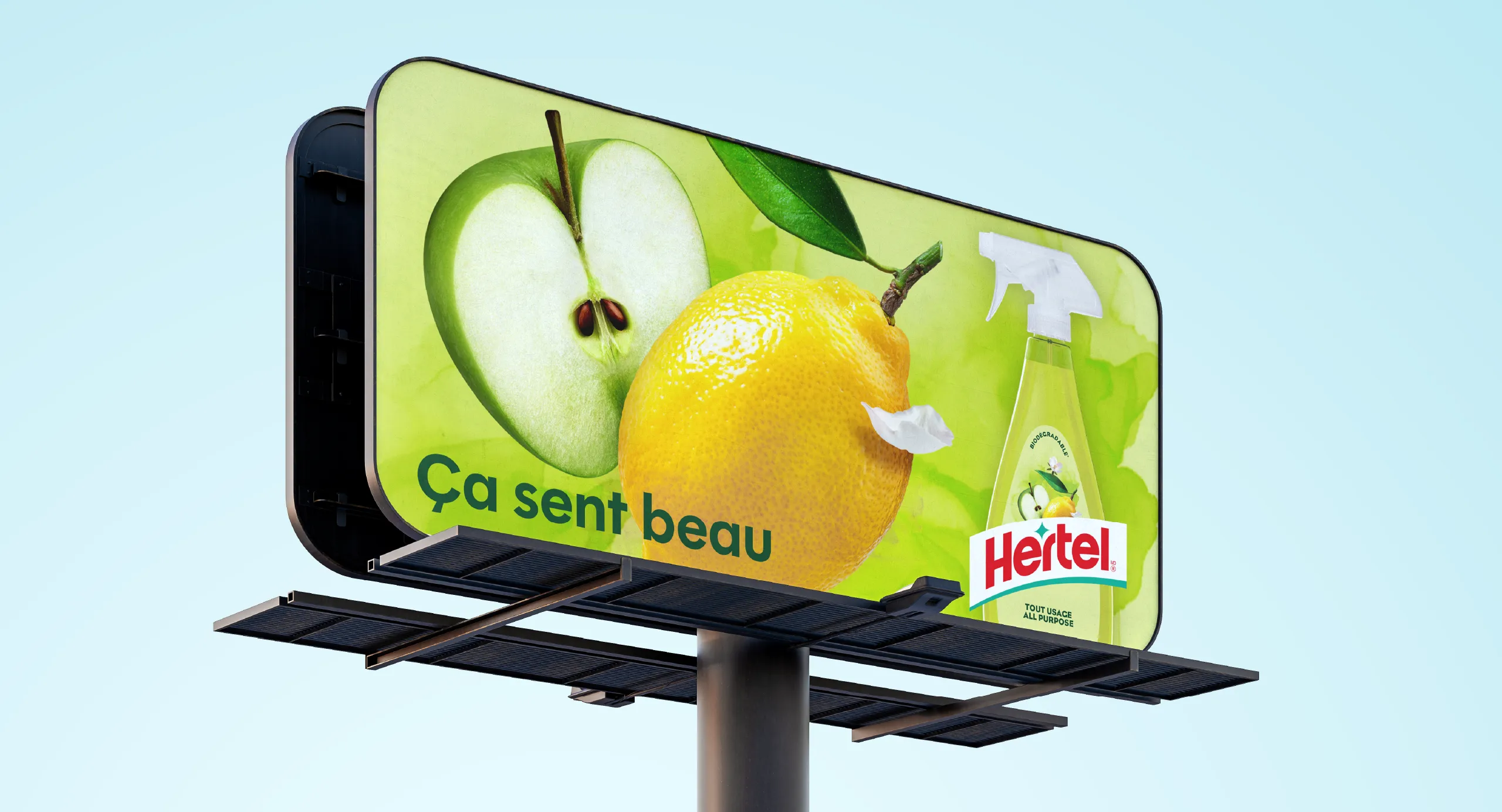
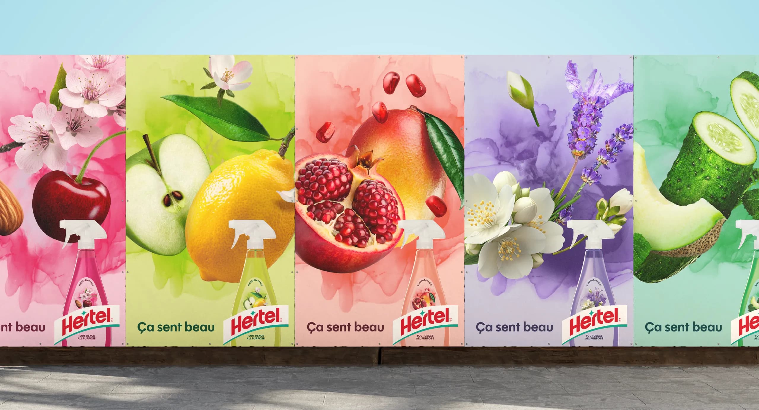
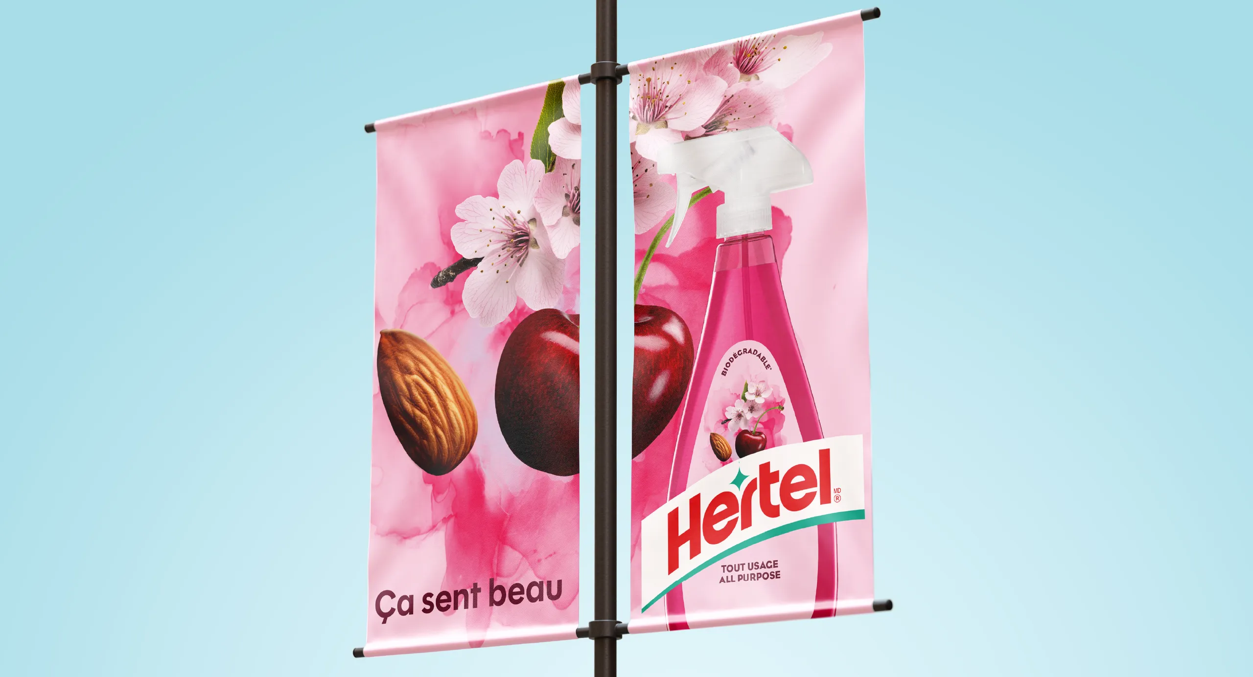
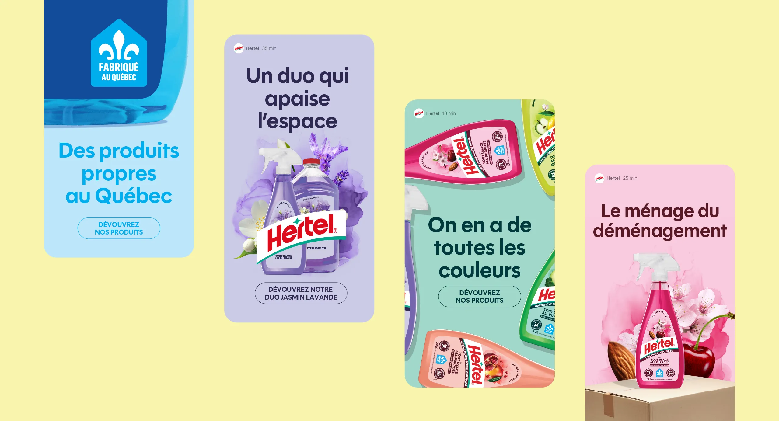
We completely refreshed Hertel’s identity, from its logo to its packaging, putting fragrance front and centre through colourful, distinctive illustrations. For the launch, those illustrations became the campaign: close-ups that magnified the ingredients and their colours, paired with a single line: Smells Gorgeous. A simple, visual approach that breaks away from the category’s traditional codes.

The best ideas emerge when perspectives come together.
The best ideas emerge when perspectives come together.